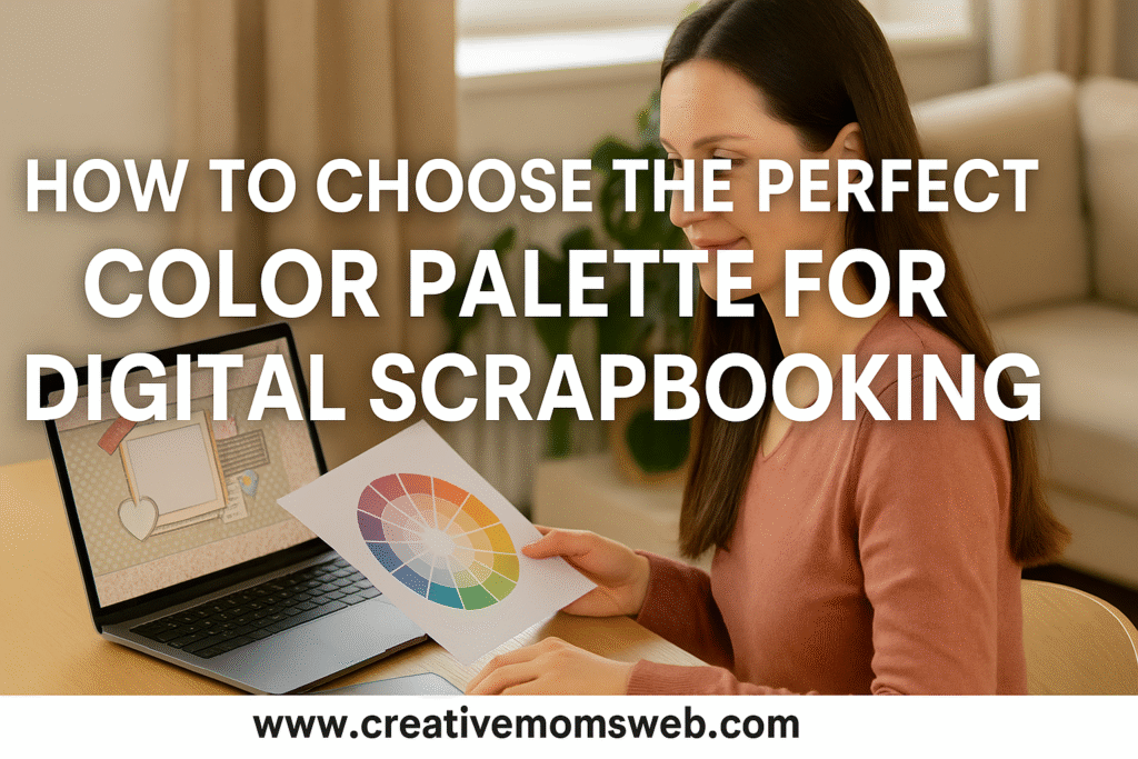
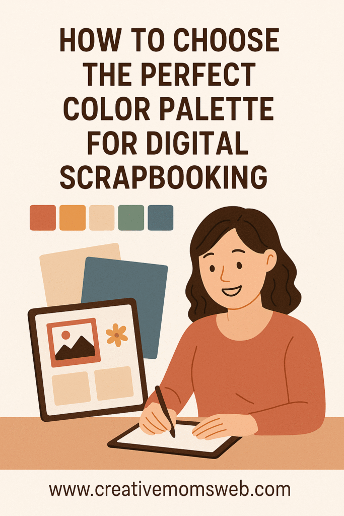
Color is one of the most powerful tools in digital scrapbooking. The right color palette can completely transform your design — setting the mood, telling your story, and making every photo stand out beautifully. If you’re a creative mom looking to make your layouts pop, learning how to choose the perfect color palette for digital scrapbooking is the key.
Here’s a simple guide to help you master color harmony and design scrapbook pages that look stunning and cohesive.

How to Choose the Perfect Color Palette for Digital Scrapbooking
1. Understand the Basics of Color Harmony
Before picking colors, it helps to know how they work together.
Here are a few foundational types of color harmony you can use in your designs:
- Complementary colors: Opposites on the color wheel (like blue and orange). These combinations create strong contrast and energy.
- Analogous colors: Next to each other on the color wheel (like pink, red, and orange). They blend smoothly and look natural.
- Monochromatic colors: Different shades of the same color. Perfect for soft, elegant pages.
- Triadic colors: Three colors evenly spaced on the wheel (like red, yellow, and blue). These give a balanced and lively feel.
📍 Tip: Use color tools like Adobe Color Wheel, Coolors.co, or Canva’s palette generator to explore harmonious color combinations.
2. Start with a Photo or Theme
When designing a scrapbook page, your photo or theme is the best place to start.
Ask yourself:
- What emotions do I want this page to express?
- What colors naturally appear in the photo (like ocean blues or garden greens)?
- What’s the occasion — fun and playful, calm and peaceful, or romantic and warm?
📍 Pro Tip: Use a photo color picker tool to extract a color palette from your images. This ensures your design matches perfectly.
3. Choose 3–5 Core Colors
A well-balanced layout usually includes three to five colors:
- 1–2 main colors (for large areas and backgrounds)
- 1 accent color (for titles or embellishments)
- 1–2 neutral shades (like white, gray, beige, or black for balance)
Too many colors can look messy — sticking to a small palette keeps your page clean and coordinated.
4. Use Neutrals to Soften and Balance
Neutral colors are the secret to keeping your design elegant and easy on the eyes.
They provide breathing room and make brighter shades pop.
Use them for:
- Backgrounds
- Journaling spaces
- Frames or borders
📍 Example: If your main colors are pink and gold, balance them with soft gray or cream.
5. Match Colors with Emotions
Each color tells a story and affects the mood of your layout:
- Warm colors (reds, oranges, yellows): Energy, love, joy.
- Cool colors (blues, greens, purples): Calmness, peace, reflection.
- Pastels: Soft and nostalgic, great for baby or family pages.
- Earth tones: Natural and cozy, ideal for home or outdoor themes.
📍 Tip: Think about the feeling of your memory and let that guide your color palette.
6. Keep Contrast in Mind
Contrast makes your design readable and visually interesting.
Try:
- Light text on dark backgrounds, or dark text on light backgrounds.
- Adding drop shadows or outlines to make titles pop.
- Varying saturation or brightness slightly between layers.
📍 Pro Tip: Use contrast to draw attention to key elements like photos or quotes.
7. Use Digital Tools to Simplify Your Workflow
Digital scrapbooking tools make color harmony easy to manage.
In software like Canva, Photoshop Elements, or Procreate, you can:
- Save your custom color palettes.
- Copy exact hex codes for consistency.
- Adjust hues and saturation until the layout feels balanced.
8. Practice and Develop Your Style
There’s no one “perfect” palette — your style and story make each page unique.
Experiment with new color combinations, mix warm and cool tones, and test textures or overlays. Over time, you’ll develop an eye for what feels right.

Final Thoughts
Choosing the perfect color palette for digital scrapbooking is all about balance, mood, and creativity. By understanding color harmony and using the right tools, you can design layouts that are both beautiful and meaningful — capturing your memories with warmth and style.
Interlinking Post Ideas
- How to Make Digital Pages Look Like Traditional Paper Layouts
- Tips for Choosing the Right Fonts in Digital Scrapbooking
- How to Use Layers and Masks in Digital Scrapbooking
Amazon Essentials for Digital Scrapbooking
Make your design process easier and more enjoyable with these essentials:
- 💻 Laptop or Desktop Computer – HP Pavilion Laptop, Acer Aspire 5 Laptop or MacBook Air M2 for smooth design and editing
- 🖊️ Stylus Pen – Apple Pencil or Wacom Bamboo Pen. Ideal for writing or drawing on tablets
- 📱 Tablet (like iPad or Samsung Galaxy Tab) – Perfect for designing on the go. Wacom Intuos Drawing Tablet for precision design work
- 💾 External Hard Drive or Cloud Storage – Seagate Portable 2TB External Hard Drive, SanDisk Portable SSD or Samsung T7 Portable SSD for backing up your scrapbook files
- 🎧 Wireless Mouse and Keyboard – For faster and more comfortable design sessions
- 🎧 Comfortable Headphones – For focus and inspiration while designing

