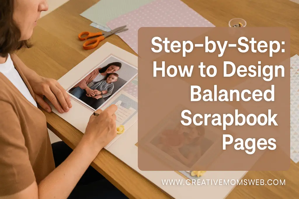
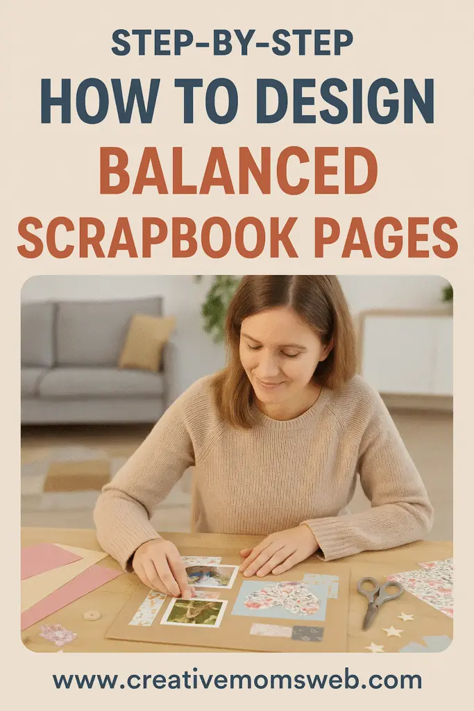
Creating a scrapbook is more than just placing photos on paper—it’s about telling your story visually and emotionally. One of the keys to a visually appealing and meaningful scrapbook is balance—between photos and journaling, colors and white space, simplicity and creativity. In this post, you’ll learn how to design balanced scrapbook pages that blend your favorite images and heartfelt words beautifully.

Why Balance Matters in Scrapbooking
Balanced scrapbook pages are pleasing to the eye and easy to follow. When a layout is balanced:
- Your photos stand out, not get lost in clutter.
- Journaling flows naturally, adding emotional depth.
- The overall composition feels complete, not overwhelming or too bare.
Whether you’re a beginner or an experienced scrapbooker, these tips will help you create harmonious layouts every time.
Step-by-Step: How to Design Balanced Scrapbook Pages
1. Start with a Focal Point
Choose one main photo to be the star of your page. Supporting photos can complement the story, but one image should draw immediate attention.
📌 Tip: Use size or placement (like centering or layering) to emphasize your focal photo.
2. Use the Rule of Thirds
Divide your page into a 3×3 grid and position important elements (like your photo, title, or journaling block) along the lines or intersections. This technique creates a visually appealing structure and natural flow.
3. Pair Photos and Journaling Strategically
Instead of scattering journaling around the page, place it:
- Beside or under the photo it describes
- In a journaling block that balances a photo cluster
- On a tag or label that adds a decorative touch
✏️ Ask yourself: What story does this photo tell? Let that guide your words.
4. Create Visual Balance with Size and Shape
If your photos are large, use smaller journaling elements. If you have multiple small photos, a larger journaling block can provide balance.
🎨 Design idea: Use circular frames or layered papers to soften rectangular photo shapes and add interest.
5. Keep White Space Intentional
Don’t feel like you have to fill every inch of your page. White space (blank areas) gives the eye a break and helps highlight your key elements.
6. Use Embellishments Wisely
Use stickers, washi tape, or die cuts to draw the eye toward your photos and journaling, not away from them.
🔄 Think in threes: Place embellishments in triangle patterns to guide the viewer’s eye through your layout.
7. Choose a Consistent Color Scheme
Limit your color palette to 2–4 colors that complement your photos. Use these colors in both your decorative elements and journaling cards or labels for visual harmony.
Sample Balanced Layout Idea
Layout Theme: “Family Picnic Day”
- 📸 One large focal photo at top left
- 📝 Journaling block bottom right with matching patterned background
- 🎨 Small embellishment cluster in top right and bottom left
- 🔠 Title centered under the photo with playful alphabet stickers
Final Thoughts
Scrapbooking is both an art and a way to preserve what matters most. By thoughtfully balancing photos and journaling, you create pages that are both beautiful and meaningful. So go ahead—gather your supplies, print your favorite photos, and start designing pages that tell your story with heart and harmony.
Want more scrapbooking inspiration?
Check out our Scrapbooking Starter Checklist, browse Essential Tools Every Traditional Scrapbooker Should Own, or read How to Scrapbook on a Budget!

